Unlocking The Secrets Of Color Psychology – Holi Special
Influence of Color Psychology
In this modern world, there is a creative use of Color psychology. However, remember that stereotypical hypotheses based on color psychology might pound borders of culture, generation, or gender.
Special effects of colors appear across several cultures. Warm colors like red, yellow, and orange evoke higher arousal emotions, such as love, passion, and anger. Cool colors, like blue, green, and purple, are linked to calmness, sadness, and indifference. Colors can trigger these arousal states and emotions.
Cross-cultural language of Color
For instance, YELLOW illustrates imperial power in Asian cultures and is associated with death and mourning in Latin America. Similarly, heterosexual men might find RED attractive, and women might thus think red is a beauty booster. Again, however, this significance of red might be invalid in all circumstances or for homosexual people. For example, while brides walk down the aisle in a WHITE dress at Christian weddings, in Hinduism (India), the Color white is reserved primarily for funerals and widows.
Interpretation of Color Psychology
It is an indisputable fact that color psychology influences human behavior and judgments. For example, Color even evokes or repels taste buds, thus affecting the taste of food. It analyses which colors evoke feelings and why we prefer one Color over another. With universal meaning, the perceptions of color change depending on personal experience, culture, and era. With the rise of digital marketing, color psychology has become a powerful non-verbal communication tool and an essential mechanism for the advertising industry.
Importance of Color Branding
Colors are the most vital means used in marketing and branding. They create the personality of a product and impact how consumers perceive it. Consequently, colors affect the sales of any product or service. For branding, colors are one of the most integral elements of the business identity. The research titled Impact of Color on Marketing reveals that colors increase or decrease appetite, enhance mood, calm customers, and reduce the perception of waiting time, among others. The study also found that Color influences nearly 90 percent of snap judgments about products.
Chromotherapy
When colors strongly impact our perception, here is how to evoke our senses with Chromotherapy (or color therapy) in our immediate environment and healthier habitation.
Apply Chromotherapy to our immediate surroundings to help retain tranquillity and focus on healthy habitation. At the same time, developing and defining the color scheme in our living space can bolster our aura. No wreckage is necessary!
Chromotherapy is a complementary remedy that utilizes Color and light to treat physical or mental health concerns by balancing the body’s energy centers (AKA: chakras). Ancient Egyptians used sun-activated solarium rooms constructed with colored glass for therapeutic pursuits. The ancient Egyptians, Romans, Greeks, and other primary cultures made significant medical usefulness of light. The Egyptians are said to have built temples where color healing took place. Sunlight shone through colored gems, such as rubies and sapphires, on people seeking recovery.
Use Chromotherapy in a fusion concept in day-to-day living space and add coherence to life.
Code of Colors
In physics, the three primary colors are red, green, and blue. The secondary colors are color combinations created by an equal mixture of two primary colors. So, red and yellow make orange, red and blue make purple, and blue and yellow make green. The Tertiary colors are a mix of primary and secondary colors. Six Tertiary Colors are Red-Orange, Yellow-Orange, Yellow-Green, Blue-Green, Blue-Violet, and Red-Violet, which are formed by mixing a primary with a secondary.
Besides numeric HTML color codes, Color Harmony 2 is an invaluable book for anyone working with Color. It is a guide to creative color combinations by Bride M. Whelan. In expansion, books on the psychology of Color show how artists employ it to portray desired emotions in specific spaces.
Experts in color research and fashion merchandising, advertising, and marketing, graphic and interior design, and industrial design make selections and reach a consensus on which colors will be flourishing and fashionable in the upcoming years.
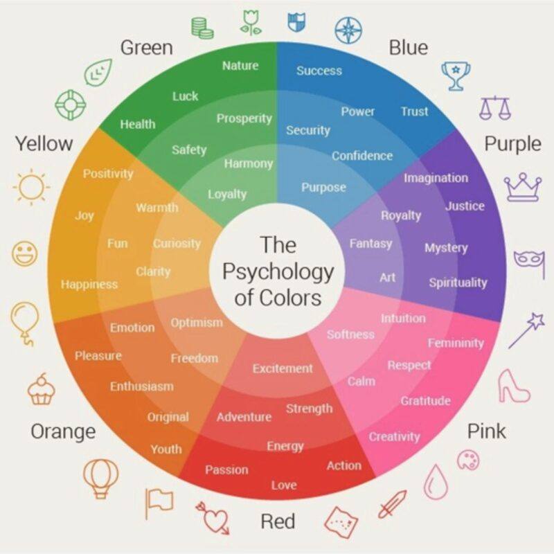
RED symbolizes passion, danger, or power, and PINK signifies innocence, femininity, and beauty. We often see BLUE in hospitals as it evokes calmness, peace, relaxation, self-expression, intuition, honesty, truth, and creativity. Yet, at the same time, WHITE represents light, goodness, innocence, purity, peace, safety, and cleanliness. Experts recommend these colors in cases of insomnia, stress, anxiety, over-excitement, or anger.
One of my favorite colors is YELLOW, which elevates uplifting and cleansing energy. The Color of the Sun also signifies self-confidence, self-control, self-respect, the ability to rationalize and reason, and contentment. It is mentally stimulating and recommended for depression, despair, and fatigue. It decreases negativity too. According to color healing therapy, ORANGE is one of the best colors for hospitals, particularly for children’s rooms.
The color PURPLE symbolizes spirituality and creativity and inspires us to reveal our innermost thoughts, enlightening us with the wisdom of who we are and encouraging spiritual development. It is usually associated with royalty and luxury, and its mystery and magic spark imaginative fantasies.
BROWN spurs earthy, sturdy, rustic feelings, and GREEN gives a natural, stable, prosperous feeling.
BLACK symbolically or figuratively illustrates the dark. It is the absence or complete absorption of visible light, an achromatic color without hue, like white and grey. Usually, Black & White describes opposites, such as negative and positive, night and day, and the Dark Ages versus the Enlightenment. Judges and magistrates wear Black because it symbolizes solemnity and authority. In addition, wearing black at a funeral indicates that you are mourning the loss of someone and is considered a sign of respect for the deceased.
GOLD is the Color of success and affluence and is commonly associated with Champions. This Color harnesses masculine energy and the Sun’s power with its strong, warm undertones.
SILVER is a gentler color than gold, representing feminine energy and the sensitivity of the moon. It is the Color of grace and elegance. The cooler undertones of silver blend well with lighter shades and serve as a highlight that adds a touch of sophistication. It also works well with darker colors and gives products a modern, hi-tech look.
BRONZE is a mixture of copper and tin. It belongs to the family of browns, and it is a color associated with experience and earthiness. Like the psychology of brown, the Color exudes the aura of nature and ideas of maturation, strength, and security. It symbolizes earthly riches and comfort that musters a personal response in the consumer.
The Color Wheel
A color circle or a wheel is an organization of color hues around a process, showing the relationships between primary, secondary, tertiary, and other color combinations.

Intuitively, you can go for colors that look good together. But for those who do not want to go beyond instinct, several predefined color scheme standards can help us choose appealing color combinations. These combinations fall into two categories: harmonious (analogous) schemes based on adjacent colors and contrasting (complimentary), derived from opposite wheel segments.
Armed with the knowledge of making emotional interpretations with Color, we define the color palettes for our home or workspace. Unfortunately, Color palettes might be one of the most underutilized sections of our lives. It can be the distinction between immersing our guests in a magical world of visual communications or feeling like missing a layer of emotion. Designating a color palette is the magic work of an art director – to identify a design style for the required mood in any given room.
Another crucial expertise is understanding lighting, which creates various hues and highlights in every element around us. Light affects our spirits by soft-soaping our hormones. For instance, sunlight exposure can boost serotonin levels, a hormone that aids in regulating our mood. Light also affects our circadian rhythms, which are the internal clocks that tell us when to sleep and wake up.
Revitalize your personal space with a splash of color psychology, and senses!
These techniques can quickly recharge our living space. Below are essential design secrets that suggest positive changes. This exercise will keep you active and create harmony in your personal space.
- Identify an area in your home where you spend most of your time.
- Incorporate soothing shades using fabrics to play with colors and add texture.
- Introduce scent to involve our sense of smell by lighting perfumed candles or simply having potpourri in a bowl that evokes happy memories.
- Caring for plants is an act of compassion; the more empathy we have, the better off we are. So, think beyond the windowsill and sneak in some greenery wherever you can.
- With exposure to sunlight, our body produces vitamin D naturally. So, a splash of the Sun is a great idea, wherever possible.
- Place photos that inspire you, whether family, friends, or simply images of nature. But be mindful of clutter. Less is always more!
- Work with layers of lights to create a mood that makes you feel like being on vacation.
- Creating a good rhythm with our furniture is equally important as it defines our guests’ proximity and energies.
- Placing a bowl/basket of fruit or a jar of your favorite cookies can add joy to our senses of taste.
- Lastly, ambient music helps to soothe our bodies and relax.
Apply all five senses to your personal space: touch, sight, hearing, smell, and taste. The sensing organs associated with each sense send information to the brain to help us understand and perceive the world around us. It is about engaging our five senses to feel loved and love others.
Practicing some Chromotherapy (color therapy) combined with the five senses will help you stay healthfuller at home.
References:
- color wheel source: Pinterest
- colormatters.com
- colorpsychology.org
- en.wikipedia.org/wiki/Chromotherapy
- neurofied.com/effects-of-color-on-behavior
- signetbranding.com
- speakingtree.in/blog/why-do-Hindu-widows-wear-white
- superside.com/blog/color-branding
#ColourPsychology; #HoliSpecial; #HoliFestival, #TusharUnadkat


